Chart blocks
No-code charts for fast exploratory analysis
Chart blocks allow you to create charts from Pandas DataFrames without using code. They are perfect for fast exploratory analysis, or for those who are not familiar with how to make charts using Python code.
To get started, you can watch our quick demo on chart block configuration.
Adding a chart block
You can add a chart block to your notebook by clicking on the Visualize button in the upper right corner of a Dataframe output table.
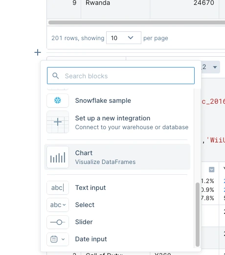
Alternatively, you can also add a chart block by pressing the Add block (+) button in between blocks and selecting the Chart option from the menu.
Setting up the data
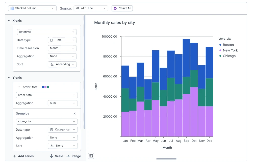
To start, you need to select a DataFrame to visualize in the upper left corner. By default, your chart will be simple column chart, if you want to switch to different type (e.g. line chart or scatter), you can do so using dropdown in the top left corner.
Once you picked a DataFrame, you need to configure which data to display on the chart. Depending on selected chart type this can be either X/Y axes or segment's color and size for circular charts. Both can be adjusted from the first two sections of the sidebar. Just select a column you want to visualize and adjust settings if needed (we'll go over those in a minute).
In this doc we'll be referring to those setting as dimension and measure. Dimension describes categories (structure) of your chart. For example, in "Monthly revenue" column chart this is "monthly" part and will be displayed on X axis. Dimension settings are always located in the first section of the sidebar. Measure is quantitative value which you want to analyze or summarize on a chart. Following our previous example, this is the "revenue" part and it will be charted on Y axis.
Dimension and measure can correspond to different axes, depending on chart type. For example, in column chart dimension is X axis and measure is Y axis. But they are swapped in bar chart. In pie and donut charts, dimension is color of the segment, while measure is its size.
Chart AI
Not feeling like pointing and clicking today? We got you. As an alternative to manual setup, you can also ask Deepnote AI to create a chart for you. Open Chart AI by clicking Chart AI button on the top of the chart block, type in what you want to visualize, and hit Submit. In a few seconds, Deepnote AI will respond with a chart suggestion. You can accept it (Done) or reject (Undo) and adjust your description.
The accepted chart will have all the configurations filled out for you. You can use it as a starting point and manually tweak things further. You can also request follow-up edits from Deepnote AI by typing in a new prompt to modify your existing chart.
Adjusting how data is interpreted
Depending on chart type and data type, there are couple of additional settings that change how data is interpreted and charted. You'll find available settings next to the column dropdown.
Data type
Depending on the chart type, you might be able to manually change the data type of selected column. Deepnote supports 3 data types.
-
Nominal — categorical data without a specific order among values. For example, product categories in sales report.
-
Temporal — data related to time and dates. Following our sales report example, order date will have temporal data type.
-
Quantitative — numerical data that can be measured and analyzed mathematically, e.g. product prices or store's revenue.
Aggregation
Quantitative and nominal fields can have an aggregation. Aggregation allows us to combine multiple records into single summary value.
Nominal fields support two integration: count which reduces set or records to single number representing their count, and distinct which returns number of unique values of selected column among matching set of records.
But aggregations really shine with quantitative fields. In addition to count and distinct you can calculate sum, min, max, average, and median.
Binning
In addition to aggregation, it's possible to bin quantitative dimension field into set number of ranges. Those ranges work as categories for data, so you can, for example, chart average customer satisfaction score depending on their age group.
Time resolution
For temporal fields you can select how precise you want your chart to be. All records will be grouped by selected field into groups depending on the selected resolution. For example, setting resolution to "Year, month" allows you to analyze monthly revenue over time. Or you could set it to "Week" to analyze seasonality of sales across multiple years.
Group by
Grouping allows you to add another dimension to your chart. But instead of making it 3D and hard to read, it adds color. To add grouping to series click + Group by and select column which should be used for grouping. Don't see it? That means selected chart type doesn't support grouping, try another chart type.
Results will vary depending on selected chart type and data type of the column used for grouping. Grouping by nominal column will split chart into multiple elements, one for each value of the grouping column. If you selected stacked chart type, those elements will be stack one on top of another, otherwise they will be displayed side-by-side. Grouping by nominal field, for example, allows you to see monthly revenue for each store location instead of single total value.
Grouping by quantitative field with applied aggregation will change color of the element depending on the value of the column. For example, if you have "Sales by location" chart, you can add grouping by average value of order.
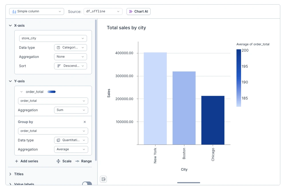
To change color palette you can click on color/palette badge next to the series name and select one from the built-in palettes.
Filtering
You can slice and dice your data right from the charts with interactive filtering. Select data points to filter in/out in one of two ways.
- Highlight a range of data points with mouse-select.
- Click on individual legend entries of grouped series.
Once you selected some data, press the Keep only or Exclude buttons to filter in/out the selected data points on your chart. You can also combine multiple filtering steps to drill down even further.
You can also apply conditional filters on your charts, giving you more precision and the ability to apply more complex filtering logic. Simply click the Filter button in the block actions menu, select the column you wish to filter, choose an operator and a value for your condition, and press Apply.
Applied filters are always added to the Filters list, making them easy to remove or modify. You can also combine multiple conditional filters — just press the plus button in the Filters list to add a new filter for more complex filtering logic.
Conditional filters are also available in Apps! By utilizing filters, your audience can easily slice and dice the plotted data themselves, enabling them to focus on particular aspects of interest. This greatly extends the self-serve capability of your Apps, making them more dynamic and eliminating the need to anticipate all filtering needs in advance.
Combo charts
Sometimes, one series is simply not enough. Like peanut butter with jelly, some visualizations are miles better when combined. In Deepnote you can add multiple series to your charts, use dual axis, and switch series type.
To add new series, click + Add series. Some chart types (like donut or histogram) don't support multiple series, so if you don't see the button try changing the chart type in the top left corner.
In addition to all the usual series settings, you can switch series type. Click on the icon right to the column dropdown and select one of compatible chart types. Additional series can be switched to use secondary measure axis by changing Axis settings. This is very handy to show correlation between series with values of different magnitudes.
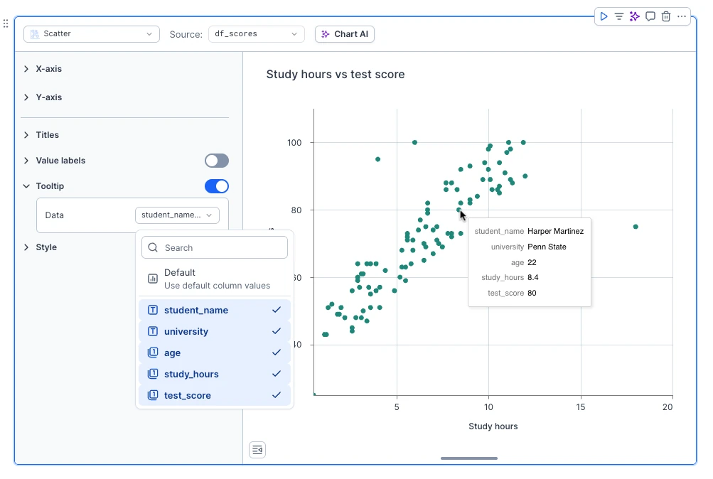
Custom tooltips
Ever needed to show just a bit more information on a chart without cluttering the entire visualization? With custom tooltips you can enrich your charts by selecting additional columns from your plotted DataFrame to display in the tooltip — not just those configured on the chart.
It’s perfect for highlighting more information for an unusual data point on a scatterplot or adding context with an extra metric on your bar charts, all without overwhelming your audience.
Simply go to the Tooltip section and select which column you'd like to display.
Visual settings
With main data-related settings covered, let's go over how you can adjust look and feel of your chart.
Titles
You can change chart title, as well as axis titles (if applicable) in the Titles section (no surprises here) of the sidebar. For axis titles you can also hide them completely, or, if you leave them empty, default value will be used.
Value labels
In the Value labels section you can enable displaying value labels for a series. Value labels can be displayed as numbers, percentages, or in scientific notation. You can also control number of decimals.
For pie, donut, and normalized chart types it's possible to switch from displaying of absolute values to percentages of total. This is controlled by Show as setting in the Value labels section.
For pie and donut charts you can also select if you want to display value labels inside or outside of the chart.
In the Style section you can set formatting for labels on quantitative axes.
Resizing charts
Once you’ve finalized your chart, you can collapse the configuration sidebar to make the chart fill out the whole block. If you wish to present charts on larger displays, you can switch to full-width mode for your notebook. You can also vertically resize the chart by dragging the resize handle at the bottom of the chart canvas.
Customize charts with code
If you need more flexibility to customize your charts, you can duplicate your chart block into code by selecting the option in the block actions menu.
This adds a new Python code block to your notebook, containing the configuration of your chart in the Vega-lite specification format. Vega-lite is very powerful and fairly easy to learn so it’s a great option if you need to create a finely customized or super advanced visualisation.
Limitations
You can chart DataFrames of all shapes and sizes, Deepnote doesn't apply any limitation on the number of rows. As long as the DataFrame fits into the memory of the machine and there is enough memory to process it, it will be charted.
However, we apply a limit of 5,000 data points post-aggregations. In cases when a DataFrame exceeds 5,000 rows after applying aggregations, Deepnote will display only the first 5,000 data points.
For example, imagine you're preparing a yearly sales report. You have DataFrames with all orders from last year, it contains 1,000,000 orders (sales were good last year!), and you want to chart the number of sales per each month. In this case your whole dataset will be aggregated to just 12 data points, and Deepnote will happily chart that for you.
In the next chart, you might want to show the correlation between customer age and how much they spent last year. You have a DataFrame with 50,000 users and their spendings last year, and you intend to use a scatterplot to showcase this data. Since there is no aggregation, this will produce a chart with 50,000 data points. Rendering this many data points can cause browser performance issues and make the chart hard to use. So Deepnote will render only the first 5,000 data points to avoid this.
Don't really want all those dimensions, measures, series? Just want to show important metrics in your app? Check out our Big number block! It looks excellent on dashboards.